Friday, March 9, 2012

Not Quite Finger Paint

I have been stalking chalk paint bloggers lately. That is substantially less threatening than it sounds. I have just become enamoured with chalk paint, and there are a few people who do it pretty well. I have been watching all their tutorials and reading and subscribing to their blogs. It is really the Washington Post's fault. If it weren't for the Post, I wouldn't even have a clue this stuff existed. And Pinterest. Pinterest is also responsible.

So about a month ago, the Washington Post Home section runs an article about this women who does furniture refinishing out of her home in Arlington, VA.
http://www.washingtonpost.com/lifestyle/home-garden/an-arlington-bloggers-home-renovation/2012/01/25/gIQAMxVZzQ_story.html

So I start reading the article and I think, "I need to know this woman." So I read her blog, http://www.blueeggbrownnest.com/  and she has all the furniture she has redone posted and for sale. It's fabulous! Plus she's a cute mom who loves her family as well as being a crafty, thrifty artist in her "spare time". I love her Belgian/French look with its chalky white tones accented with grey and blue. So restrained and elegant. (Not that there is even one room in my house restrained enough for it to work) In the article, it mentioned that she used a special paint, Annie Sloan's chalk paint.

This is where the stalker in me came out. I went where any good visually inclined woman of 40 something would go....Pinterest. Chalk paint everywhere. So I follow the links of my favorites back to their blogs.....after spending a bunch of time drooling over http://www.anniesloan.com/ . I kept finding pics I liked on http://www.freckledlaundry.com/, so I subscribed after watching Jami's cute chalk paint tutorial on youtube. http://www.youtube.com/watch?v=LbdF7iY9WWo&noredirect=1 (How did anyone learn anything on their own before YouTube?)

That one led me to the tutorial by Shaunna of Perfectly Imperfect http://www.perfectlyimperfectblog.com/2011/06/chalk-paint-faqs.html . I decided she was one of the cutest people that I don't know in person, so I subscribed to her blog too. Both of these tutorials refer to Miss Mustard Seed's Waxing 101 tutorial, so I headed over there.

Miss Mustard Seed is another one that gets quite a few hits on Pinterest. Here's the link for Waxing 101. http://missmustardseed.com/2011/03/waxes-101/  It really IS fantastic. And my favorite thing about her is that her name is Marian, yes, with an "a".

Somewhere in there, one of the bloggers (sorry ladies, I can't remember who it was) had a "post your chalk paint" contest. I don't know who won on the site, but Janet of The Empty Nest certainly got my vote with this amazing sideboard. http://theemptynest-janet.blogspot.com/2012/02/you-will-either-love-it-or-hate-it.html Her technique used such amazing color combinations! Things I would never have thought of on my own.

As I read and stalked and pinned, I started to realize a few things. These were people like me, home, arty, incapable of not creating stuff and making their worlds prettier. I was like them. They were like me. I could do this. I bought my paint.

I bit the bullet and using some barn sale money bought the Chalk Paint Kit along with 2 more colors from Patty, the highly recommended stockist at Best Furniture Paint in New Jersey.  http://shop.bestfurniturepaint.com/Annie-Sloan-Chalk-Paint-Kit-176.htm . And she is just as wonderful as everyone says. There was a question about what color I had ordered, so 3 hours after I had placed my online order, Patty herself called my house to clarify! That is some serious customer service. And the kit was the best deal I could find anywhere.

You can imagine how hyper excited I was by the time the paint arrived a few days later. It was dreamy. Such saturated colors. As fate would have it, my parents were here, so I had to wait four whole days to use it. But somehow I lived.

You wanna see what you can do with chalk paint?


And yes, it can be a much softer look than this. But you have to cut me some slack. I had to wait four whole days to play with these pretty colors. Did you seriously expect me do something subtle?

I think this may be the most fun product I have EVER used. It is fast, flexible, and really, really pretty. The magic comes from sanding after you wax the paint.

Here's how it works. You start with a piece of something. I used an oak plate.

With Annie's paint, you can just paint right over the wood, finish, everything. So it looks like this:
Then you add another color like this. I beat it up a little with a wet rag right after painting, to give a bit of grit and texture.
This picture is the bottom of the same plate, but you get the idea. Once all that has dried, you can wax it. The first coat of wax is clear and doesn't show up very well on white. Once that dries, you sand the plate. Somehow, the paint and the wax bond and the sanding works more like blending than color removal. Here you can see the difference on the red and blue plate. The first pic is the waxed paint before sanding.


The second is the sanded paint.
See how the wax drags the paint and blends it like an Impressionist painting?

So that's the clear wax. You sand and then add more wax and let it dry over night. Then you can polish it with a soft cloth to make it all shiny.

Now back to the white plate. I sanded, then decided to try the dark wax. You put this over the light wax and sanded paint for an aged finish. Then wipe off the dark wax using a rag and/or a bit more clear wax. The dark wax gets all in the nooks and crannies and really highlights the groves and grain of the wood. It's pretty amazing on oak. See?:


That's with a flash. Here's without:

The real color is somewhere in between. But I love it!

This really was my attempt at a calmer color pairing. I thought for sure I could make something "still" out of white and beige. I think I should probably give up trying to do calm things. Apparently, it just isn't in my nature.

So what we have learned here is 1) following Pinterest posts to their source is a great way to penetrate the Blogosphere, 2) Patty at http://www.bestfurniturepaint.com/ really is as nice as everyone says, and 3) chalk painting is fast and completely addicting. I finished 4 pieces in 2 days from start to finish. And while I am a total spaz and was hyper focused the whole time, that is really fast, even for me. So go get some and give that ugly piece of furniture with pretty lines a makeover.

Sunday, February 26, 2012

A Shift in the Season

As I get farther into this "being an artist" thing, I am constantly surprised by how this job is so much more about the Journey, than the results. The final product does matter, and I have become completely addicted to finishing stuff, but it's the knowledge that I gain and the self control that comes from following something through all the way to the bitter end that makes me more than I was before, not so much the piece itself.

That said, this week I hope to package up and deliver a piece I have worked on over the course of the two years of my professional career. It started as something completely different than it ended up being, and that was part of the fun. About 3 falls ago, I got really obsessed with recreating the colors and patterns of the fall leaves. For those of you in the West, take your sunsets in all their glory and variety, and squish them into little bits of tree lying all over the ground below you and all in the trees above you. That's kinda what a good fall out here in Virginia is like. Magic.

Anyway, leaves. I started drawing leaves. And I was thinking about trying my hand at art as a career, so I thought "What can I do with leaves?" I was doing a lot of scrapbooking at the time, so I thought, "hmmm, can scrapbooking be art?"


and produced this lovely little gem. Even I had to admit, "Um.....scrapbooking and art? Not so much....."

Undaunted, I tried a few other things. I pulled out my pastels and started fooling around, trying to see if I could make something that captured the beauty of these leaves. And suceeded.....But that's another story.

I kept going back to the idea of a multi panelled piece that captured the full range of beauty during the fall. Somehow I came up with the idea of doing a tryptic; three large pieces, showing the same tree at three different stages of the fall. It was going to be all about time passing, three different times of the day, (morning, noon and sunset), a close-up leaf aging while the full tree's leaves brightened, aged, and blew away, finishing with the peace of early November. I'd tell people about it, and their first comment would always be "Where are you going to put it?" Rather deflating to a newly minted artist.

In late October, 2009, I started the first section, "Morning, mid-October", and immediately realized how much harder this was going to be than originally planned. I had planned on using scrapbook paper to do the leaves with. But there was one problem.....None if it was bright enough. Not even close. So I had to paint the paper to make the leaves with myself. I used acrylic craft paint, because I had it and just gently swirled the oranges and reds and greens and golds together, without really blending them. Then I used a leaf shaped punch to make the leaf shapes. The size of the punched leaves set the scale for the rest of the elements in the picture.

Then there was the issue of what the tree should be made of. I found the perfect thing in hand made paper at Plaza Art Supplies. A nice, chunky, grey brown paper with lots of plant bits in it. The grass proved a bit more challenging. I couldn't find the right green. So I bought a bunch of not right greens to see if I could make it work. By now the piece looked something like this:


Notice the large leaf, on the left. At this point, I had made templates of both the tree and the larger leaf, so I could use the same form in all three pieces. Here is another pic once I had added the grass "hill":


The long weird thing that looks like a giant root is actually a piece of another green I was playing around with using. I can't even remember what I was thinking with that one. The sky is done in soft pastel with soft blues, yellows and some red, and I actually wrote down the formula, a move that proved completely prophetic when I had to recreate the color and texture exactly 2 years later. It was about this point, I think, when I realized that 3 panels was never going to happen. I also realized that I hated the color of the grass. And that the large leaf looked weirdly out of scale with the rest of the piece. This was about 3 months after starting the piece.

So I scrapped the idea of the tryptic and went with a single piece depicting that moment when the wind comes and sweeps the better part of the leaves off the tree in one mighty gust. (Well, it's really a mighty night of gusting, but I didn't have that kind of time or range yet) I changed the dark green grass to light green and then made about 10 million more leaves. At some point it dawned on me that I needed to visually represent the wind. I had this great plan to use glass beads and went out to buy them. I can home all excited, sat down, stared at the picture and realized that I had no idea what the wind looked like. This problem actually stumped me for an entire year. There was nothing for it, so I packed up the tree and went about my regularly scheduled life.

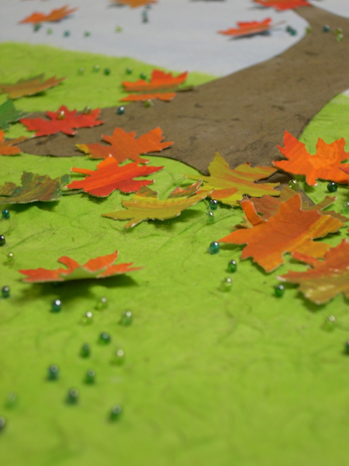
Fast forward to the end of fall 2010: I am driving towards the stop sign at the top of my street, and boom! I see it! The wind showed me what it looks like. I had been watching the entire fall and had figured out that it blew in spirals. What this gust showed me was it was lots of little spirals, all happening simultaneously, yet independently. Now I knew exactly what to do. I pulled out "the tree", as I had started to call it, got out my disposal-chewed baby food spoon, my tweezers, and my acrylic gel medium, and got to work. 1 hour at a time is all the time someone should ever spend holding a single glass seed bead in their tweezers, diping it in a spoonful of gel adhesive, and then placing it oh, so carefully on a piece of pastel covered watercolor paper. My husband came into the studio one day while I was working on the wind and said, "That just looks painstaking!" I assured him it was, but I liked doing it...for an hour. The results were exactly what I had hoped:


Implied motion. I almost wept, I was so happy. Oh and in this picture you can see another happy accident, the texture in the glass. I had gotten blue pastel on the "grass" with the side of my hand, so I tried to erase it. All it did was wad up the paper. I got really upset for a second, then I stopped and just looked at it. It had the look of grass in the wind. I yelled out happily and proceeded to "erase" the entire hill. I love the results. So much more motion. I think I "finished" the piece in January of 2011. Here is the piece at that point:


I truly thought I was done and had started wishing I had the money to have it framed. This was going to be a rather expensive venture as I had to use a frame deep enough to accomodate the the beads and the leaves that stood off that paper. (I had figured out along the way how to bend them to give as sense of even more motion):

As 18 x 24 in custom shadowboxes run in the $300 range, it was in my best interest to find another solution. So the finished piece, now called "A Shift in the Season," courtesy of my clever mother, went back up on the wall to wait.

Serendipity found me one day when I was at a local thrift shop. I turned over a large, promising-looking wooden frame, so see that it was the perfect size. On the back was written "18 x 24." I almost passed out. It was the right color and nicely rustic. Solid wood lends itself nicely the being made into a shadowbox. I tentatively looked at the price tag....Surely Fate couldn't have favored me this much.......and it was marked at $12, and then marked down 50% from there. $6? Are you kidding me? SOLD!


I knew it was meant to be when I set it on the picture. The brown of the frame is identical to the bark of the tree. I am totally not kidding.

I had to wait until Feb 2012 to figure out how to bring it all together. My "simple" (cough, cough) solution was to put spacer bars along the inner edges of the frame, thus creating the distance from the glass required to not squish the beads and leaves. I bought the spacers and layed everything out. It looked pretty, but a little flat. Then I got a vision of What It Could Be. Beware of these visions. They do lead to beautiful things, but there is ALWAYS a cost. (Usually in the neighborhood of blood, sweat and tears.) My vision involved extending the image up onto the spacers, the leaves, grass, tree, everything. So I merrily got to work. I sanded and pasteled and papered. It was going great. Then I realized what adding the leaves was going to entail. It had to be exactly centered. I had to cut the leaves off with an exacto knife to put them on the spacer and .......Well, let's just say I made it about 10 mintues until I was sobbing with the difficulty of it all.


It was not my favorite week.The side bars were too thin and had to be redone and then resized. Every minute "leafing" was tense until I finished the spacers. But I did it.  And it's lovely. In fact it's so lovely that when I finished it and layed everything out together in the frame,  I cried uncontrollably for a while. Two years......and it WORKED!


As much trouble as it caused me, "the vision" was right. Having the image extend onto the spacers gives it a sense of three dimensional motion that was lacking before, It is easy to see the leaves coming off the page, which was previously hard to see. You can almost hear the wind whipping through the branches. The difference is amazing, truly amazing.

Here are a few photos from the studio. I can't pick it up and move it into natural light yet, because nothing is attached to each other, so sorry about the flourescent light:


So there you have it. 2 years later. Not what I thought, but something cool just the same.

Sunday, February 19, 2012

Adventures in Arcosanti

So I have to admit I have been a completely lame blogger lately. Something about post-Barn Sale depletion followed by Holiday merriment and much reorganizing of children's rooms. In any case, I did find a bit of time in there to sneak off on a little adventure to Arizona,  by myself!, the first week of January.

Now my own little personal escape home wouldn't necessarily suit the purpose of this blog, except for the fact that this particular adventure included a trip to Arcosanti, an artist commune/sustainable city designed by Paolo Soleri and built right into the mountains and gorge walls outside of Prescott. (for more detailed and accurate info check out http://www.arcosanti.org/ ) The people who live here all contribute to the sustaining and building of the complex, as well as trying to help further the mission of Arcosanti. (The central idea Soleri focused on was arcology-a blend of sustainable architecture with a focus on preserving the natural beauty and environment of the building site.) They make the bells that are sold and participate in various construction projects to further expand the structure of the complex. They work in the cafeteria or the library of the foundry or the potting studio to make the art pieces that pay for everything that goes on there. You can sign up for workshops and go live there and contribute yourself, if you like. I am so there once my kids are all busy with their own lives.

Wanna see what it was like?
If your first thought was "huh?," then that makes two of us.

When you drive up, all you see is this dead looking moonscape. You keep wondering if you are in the right place. In fact, you can't really see anything until you are right in front of the complex, as in, you are about to fall in the gorge. But when you get there, it looks like this:


And what about that view? Most of the windows in the entire complex face that view in fact that last shot is taken from the Foundry, where they make the bells. Nothing like pouring hot metal with a view like that. And yes, it is a bit like a fusion of the Jetsons and the Flintstones, just 3D, and way cooler than anything Hanna Barbera could have ever drawn.

Here's a couple more of the grand view from the top ledge of the complex:


Arcosanti is it's own little microcosm. They have common areas, a library, art studios, a performing arts center, greenhouses, a cafeteria, a pool and all kinds of other amenities. There is a ceramics center, as well as a fully functioning foundry where the famous Soleri bells are made by hand. The process Soleri used to make the bells, casting them in sand molds right in the ground, led him to the central principles for the technique he refined into his building construction technique.

Here's the Ceramics Apse:
This is how they cast the ceramic bells. They pour the slip and clay right into holes in the sand. That is what makes the unique and beautiful shapes the bells are famous for.
This is what the bells look like once cast and fired. They will be combined with metal elements and then be made into a mobile-like work of art.

Here is the foundry, where they make the metal parts of the bells. It was so cool here, and I am still mad at myself for not taking a picture with the really hot guy with the dreadlocks and prolific tattoos that was working the forge that day. What was I thinking? Maybe that I am too old for that kind of nonsense. Oh wait, he's there in the bottom corner.....well, I'll just leave all that to your imagination.

See the bells hanging on the rack here? That's what they look like once they've all been strung. Below is the finished product. I think they are so gorgeous!

Here I am with the finished bells. I think the ones next to me were about $300. Out of my budget, but not too bad if you consider that the bells and the workshops are the only source of income for Arcosanti and that they are hand made, one of a kind sculptures. I will always be grateful to my mother's friend who gave me one as a wedding gift. It's not hung up right now, but I pull it out and look at it all the time. Maybe there's space in the studio....

Friday, November 25, 2011

Can't Even Process It Success

I have been meaning to post ever since Nov 13th (the day after the barn sale closed) but I was just so overwhelmed with the response to the show, that language kinda failed me. I just haven't been able to find the right expression to describe how I feel. Volcanically successful? Insanely successful? Exceeded my wildest dreams successful? In any case, I realized that all I needed to say about the show was "WOW!" and "Thanks so much for coming!"


 I am beyond grateful to all the people who were willing to come to someone's house to check out a new little business. And people did come. And they bought many things with delighted looks on their faces. They hung out and ate the samples from our fantastic caterer, Amy Palmer and brought their friends back to show, They enjoyed the environment and appreciated all the work that went into putting the show on. So thanks so much!

I think my favorite part about the show was being able to sell things for budding artists that have no other venue. My reluctant but fabulously talented photographer, Carol Edgell,  sold everything. So exciting! My Twigs (the show is called Branches, so I refer to my youth artists as Twigs) also did extremely well. All three of them sold almost everything. I was particularly pleased that the 12 year old who made the hair bows and plans on donating everything she makes to Heifer International (http://www.heifer.com/) gave me 24 bows and sold all but three. She will be able to make an $88 donation. Not too shabby!

Overall, the show's artists donated close to $250, enough to buy a water buffalo in Thailand or the Phillipines. That's super exciting, as that was the little mental goal I had set for the donation level for this show. And who wouldn't want to buy a water buffalo, given the chance?

I know this post is getting kinda long and you want to see the pictures, but I have to give a HUGE shout out to the one person who made the show possible, my admin assistant, Liisa Erickson. This girl worked her tail off behind the scenes. She's a recent college grad who is currently substitute teaching for Fairfax County Schools. She came over once a week for a while and kept me from freaking out- I mean came and did all the data entry and designed all the merchandise tags and did anything else I asked her to, without complaining no matter how boring or onerous the task was. Do you have any idea how wonderful it is to hire someone and just have them come in and do the job right, every single time, no matter what the job is? Liisa's future employer, if you are reading this YOU WANT THIS GIRL TO WORK FOR YOU. Anyway, there is no way I would have been successful pulling things together without her. And she cashiered both days as well. Liisa, you are my hero, girl! Thank you, thank you, thank you, a thousand times, thank you.

And thank you all for coming. For believing in me and my friends. For being curious and asking questions and being excited about our little creations. It really is a scary thing to make something and put it out there at the mercy of the world. So your smiles and warm compliments did us all a mountain of good. And yes......we WILL be doing this again next year. But I won't think about that until March.


And last, but not least, I'd like to thank Zoe for being our unoffical mascot.